As the founder of a leading Los Angeles interactive agency, I’m constantly reassessing the digital landscape and looking for ways to put my clients ahead of the curve. As more and more Web surfers go mobile (mobile Internet searches are expected to surpass desktop searches as early as this year), we’re seeing a rapid evolution in the ways that people process information. Screens are getting smaller, searches are getting more precise (thanks to the wonders of voice command), and information is becoming more condensed. I could go on and on about best practices for online businesses in the 21st century, but I want to focus on something specific that perhaps you haven’t considered in any profound way: the use of icons.
Why Icons Matter
Icons are all around you, whether you realize it or not. You know that if you want to pause your MP3 player, you tap the button containing 2 vertical lines. If you want to perform a search on any given website, just look for a picture of a magnifying glass. When it comes to online business, icons are powerful because they allow you to say a whole lot with very little. For instance, if you sell merchandise on your website, you don’t want to fill up valuable space with an expansive rectangular button that reads, “Click here to purchase your items.” It’s so much more efficient to just use a picture of a shopping cart.
Why do I mention all of this? Because icons are becoming more important than ever before. As I already emphasized, Web surfers are turning to smaller screens, and that means you have even less space available to organize information and get your message across. Being pithy is no longer simply a good idea. It’s absolutely critical to the success of your online business. Are you making the maximum use of icons?
The Future of Icons on the Web
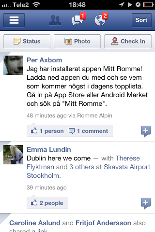
Mark my words. In the coming months, you’re going to see icons take center stage. In fact, it’s already happening. If you look at a navigation bar on a desktop-optimized website, you’ll see words and phrases like ‘About Us,’ ‘Contact Us,’ “New Products,’ etc…But if you click on an iPhone app, you typically find very few words on the nav bar. Instead, you see a row of icons. I’ll use Facebook as an easy example. The Facebook app features no words on the main nav bar. It features only icons. One icon consists of human silhouettes (to signify new friend requests), another icon consists of a speech bubble (to signify chat) and another is an illustration of planet Earth (to signify your News Feed or Facebook wall).
In the future, we’re going to see a lot more of this, even on desktop websites that utilize responsive design technologies. In doing so, we can ensure that one single website is just as user-friendly on all devices, no matter what the size or shape of the screen. Furthermore, we’re going to see icons become a lot more interactive, shifting and changing and taking advantage of useful animations.
Contact the Best Los Angeles Interactive Agency
If you’re concerned that your website isn’t making the necessary use of icons, give Coalition Technologies a call. We’re not your average Los Angeles interactive agency. We’re building the websites of tomorrow, today, and we can create custom icons that send just the right message and improve the user experience of your visitors. Call us for a free quote at 1-888-800-9101, and put your business one step ahead of the game.
